SCIBSW: Artisans Books & Coffee
One part bookstore, one part coffee shop, one part bar, one part mercantile.
How awesome is that?!?
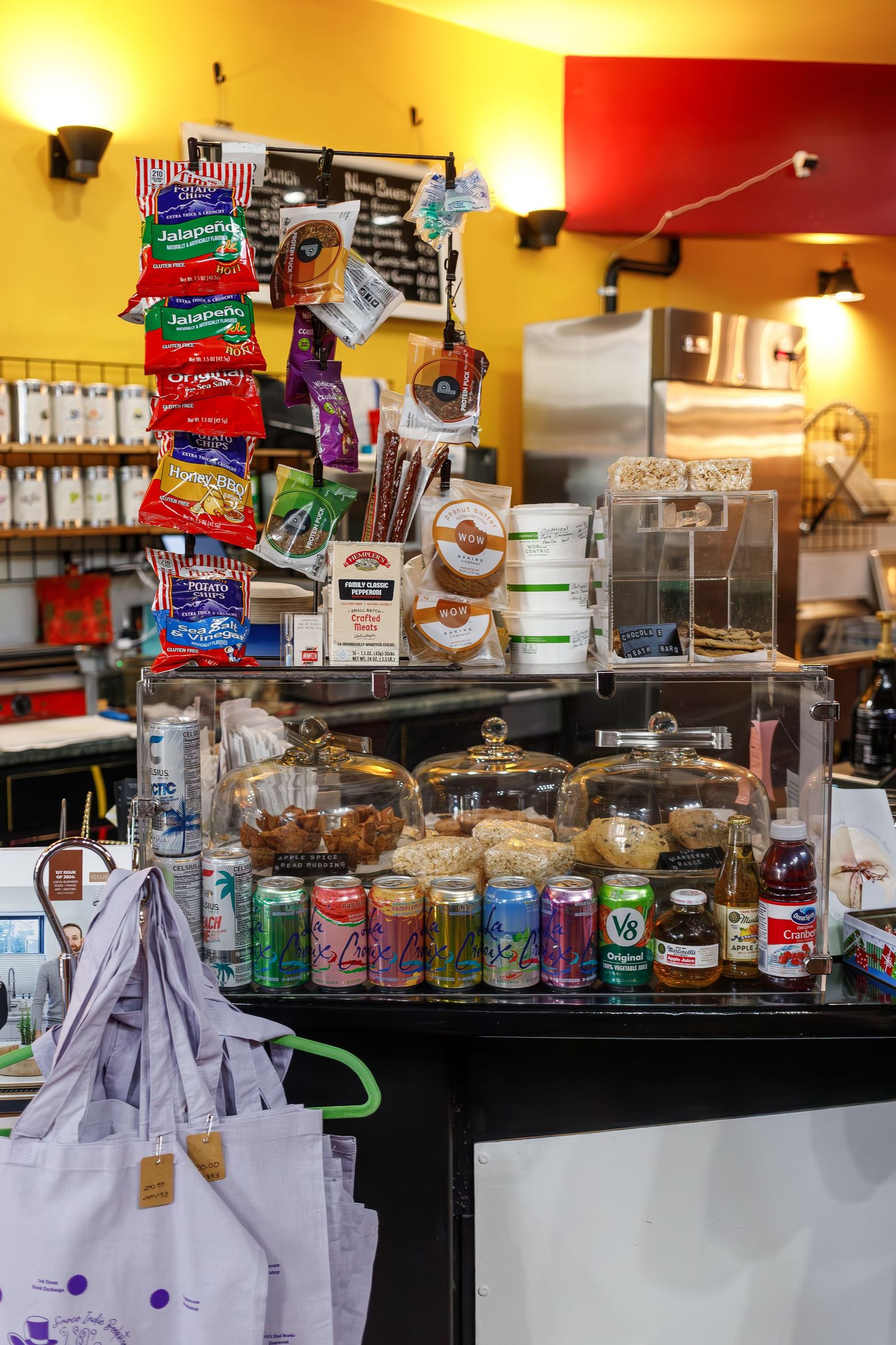
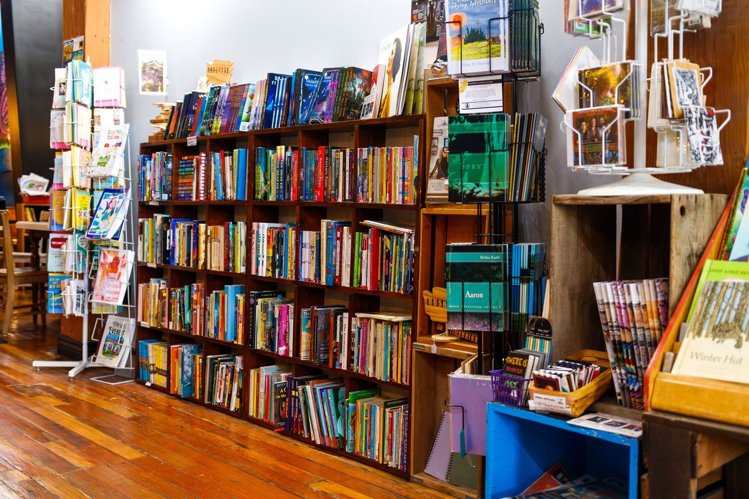
Artisans is one of those really cool, unique PNW spots. Not only is this wonderfully quirky shop a full coffee shop with food, snacks, and of course coffee, it’s also a bookstore with an adjoining mercantile shop connected next door.
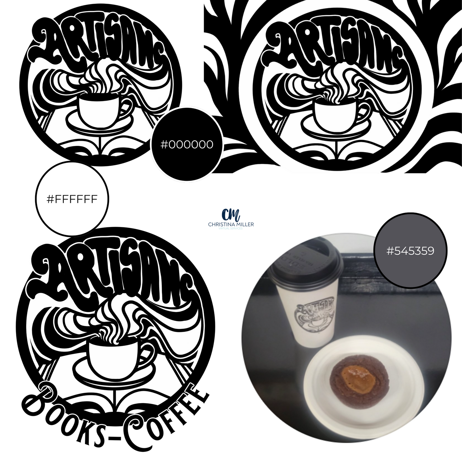
Branding Color Palette
I was so excited to see how consistent Artisan’s Facebook and Website were! Black and white, same logo and design - spot on! There did seem to be some variance when it came to the buttons on the page though, further down with some blue and red/pink buttons as well as the footer.
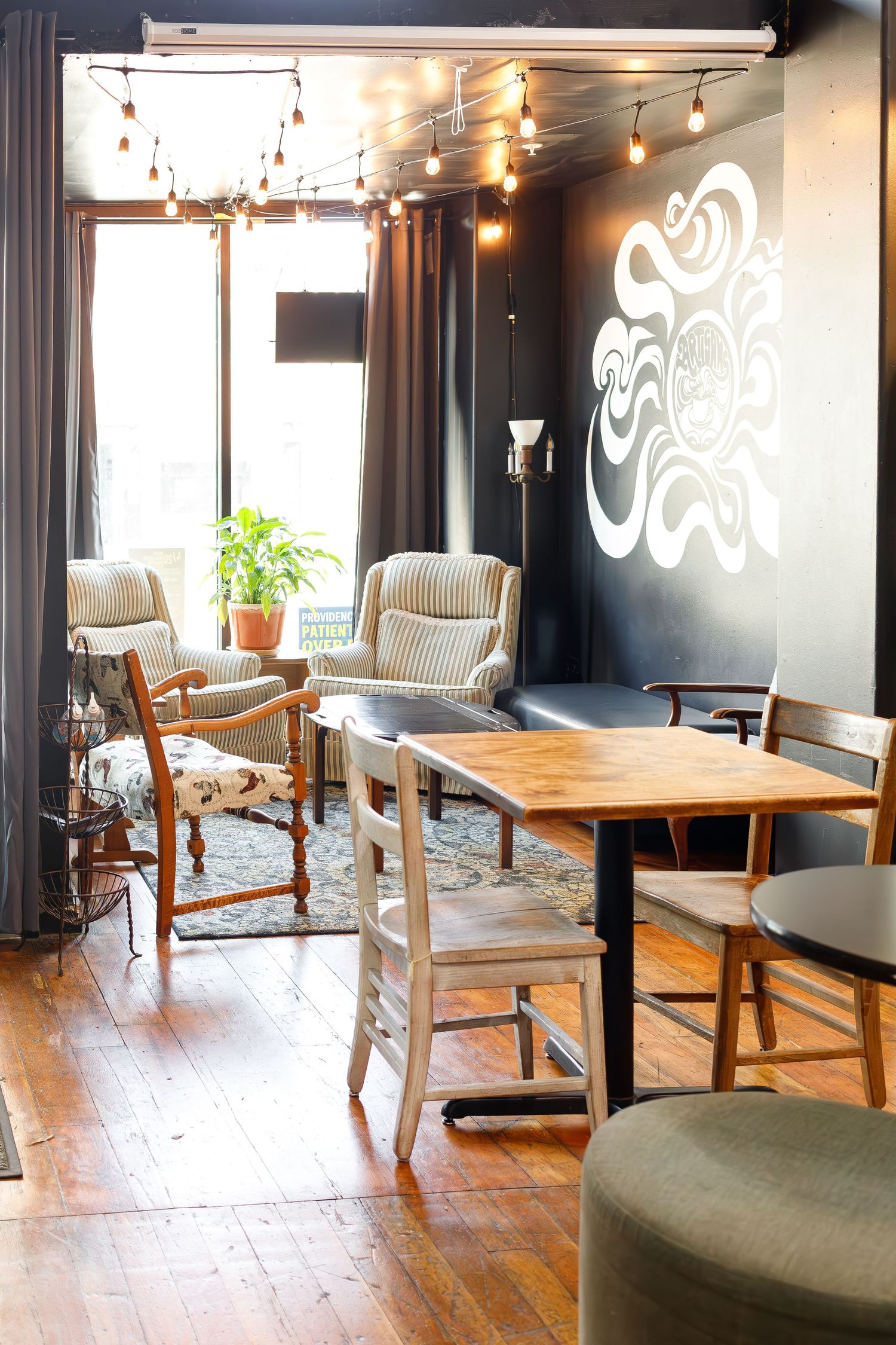
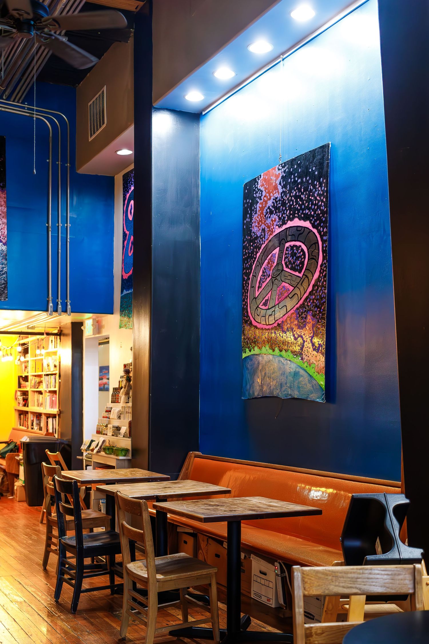
Branding typography
On the individual Books & Coffee site, there seemed to be a pretty consistent font, although I couldn’t tell you WHAT the branding typography is. I LOVE the font in their logo, but I couldn’t see it anywhere else in their website or social media.
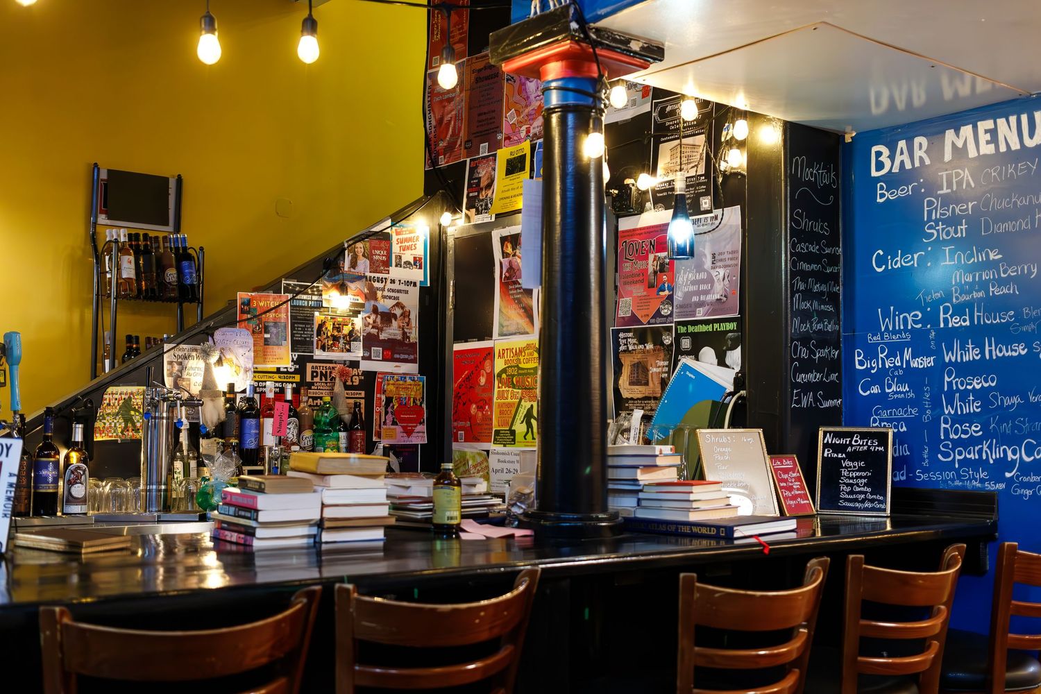
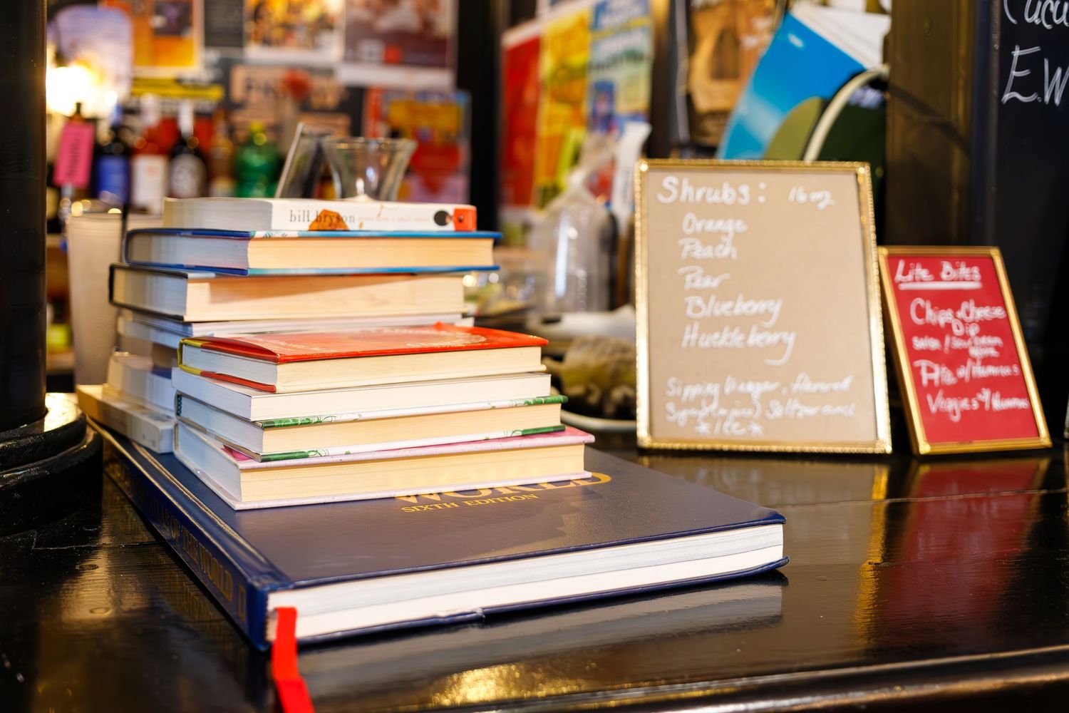
Cohesive branding
The Books & Coffee website and Facebook page are very cohesive - I love it! It gets a little less cohesive when it comes to their Instagram account and their other websites. The Instagram photo is of a coffee cup and plate with a cookie - very different from their logo itself and not immediately recognizable on social media. It seems they have three websites: one for their combined brand, one for the Artisans Mercantile, and one for their Books & Coffee shop. I will say that the look for each one is wildly different from the other. The Books & Coffee matches their store vibe the best - it has their logo on it and the top is very black and white. As I scroll down though, it gets much more modern and almost out of place. Their mercantile page is a very different feel - but I honestly wouldn’t change it. It’s a very clean, very bright online store and it’s very user friendly. Their main brand page is very modern, very clean looking, not funky or quirky at all, and very green, which threw me off. I can guess why they chose green, but I personally feel it doesn’t fit the brand at all - it feels out of place. I would love to see a more cohesive brand throughout all three pages so it truly feels like it’s all part of the same family.
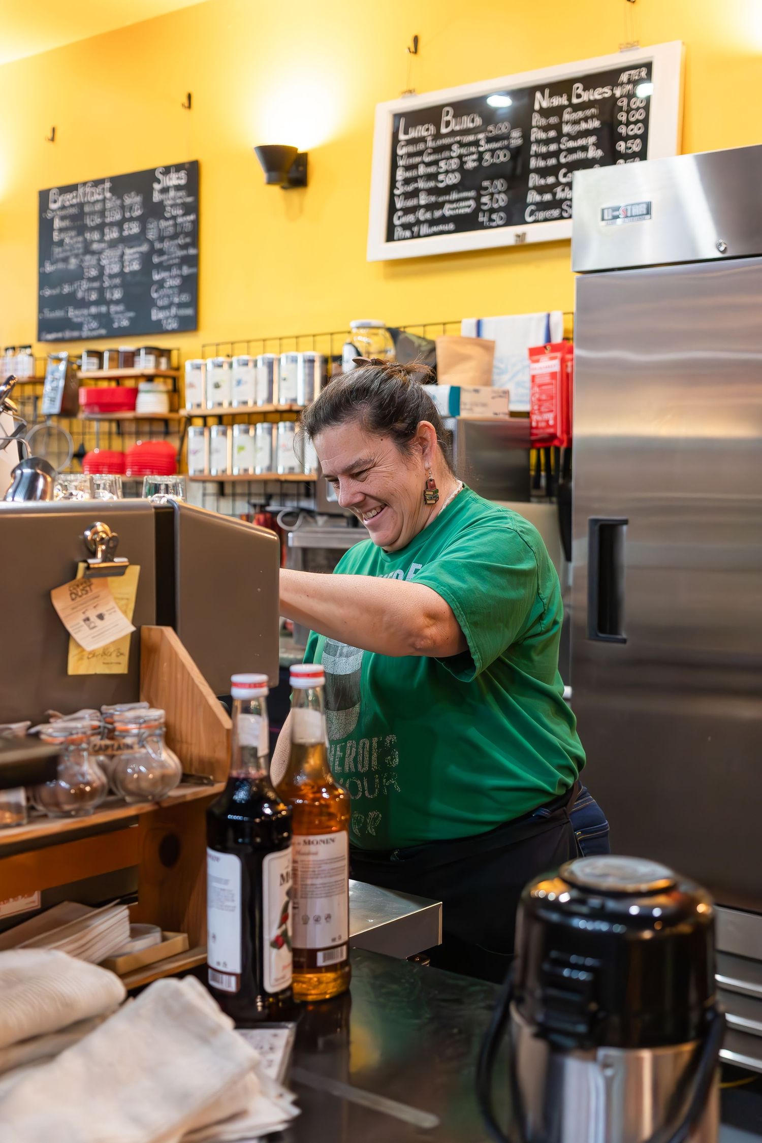
Personal Branding
I feel like I know nothing about the WHO behind Artisans! I did find a small bit on their Mercantile page about HOW the shop started, but other than that, I don’t know much of anything about who runs and owns it. I would love to see photos of the owners, I would love to see bios or a small bit about who they are, why they are doing what they are doing, a photo of them with their favorite book or hobby, something! I know that there are three co-owners and I know they are women….but WHO are they really? I would love to be able to cruise a website, and then be able to walk into the store and know exactly who is who. It makes it so much easier to identify and connect!
How fun would it be to do a an in store, all employee and owner personal branding session, so I can capture all the unique personalities and quirks within? A girl can dream!
Final Thoughts
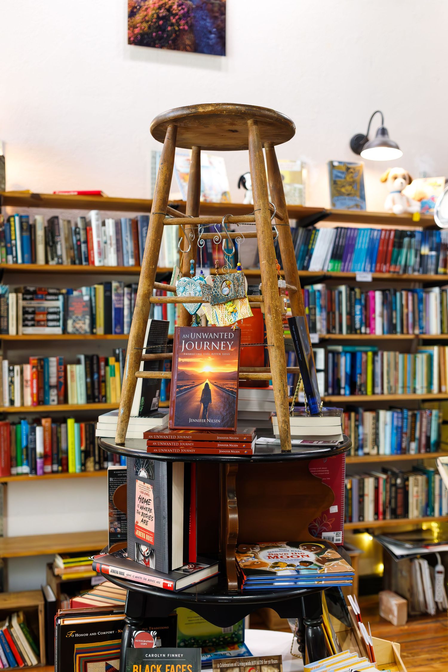
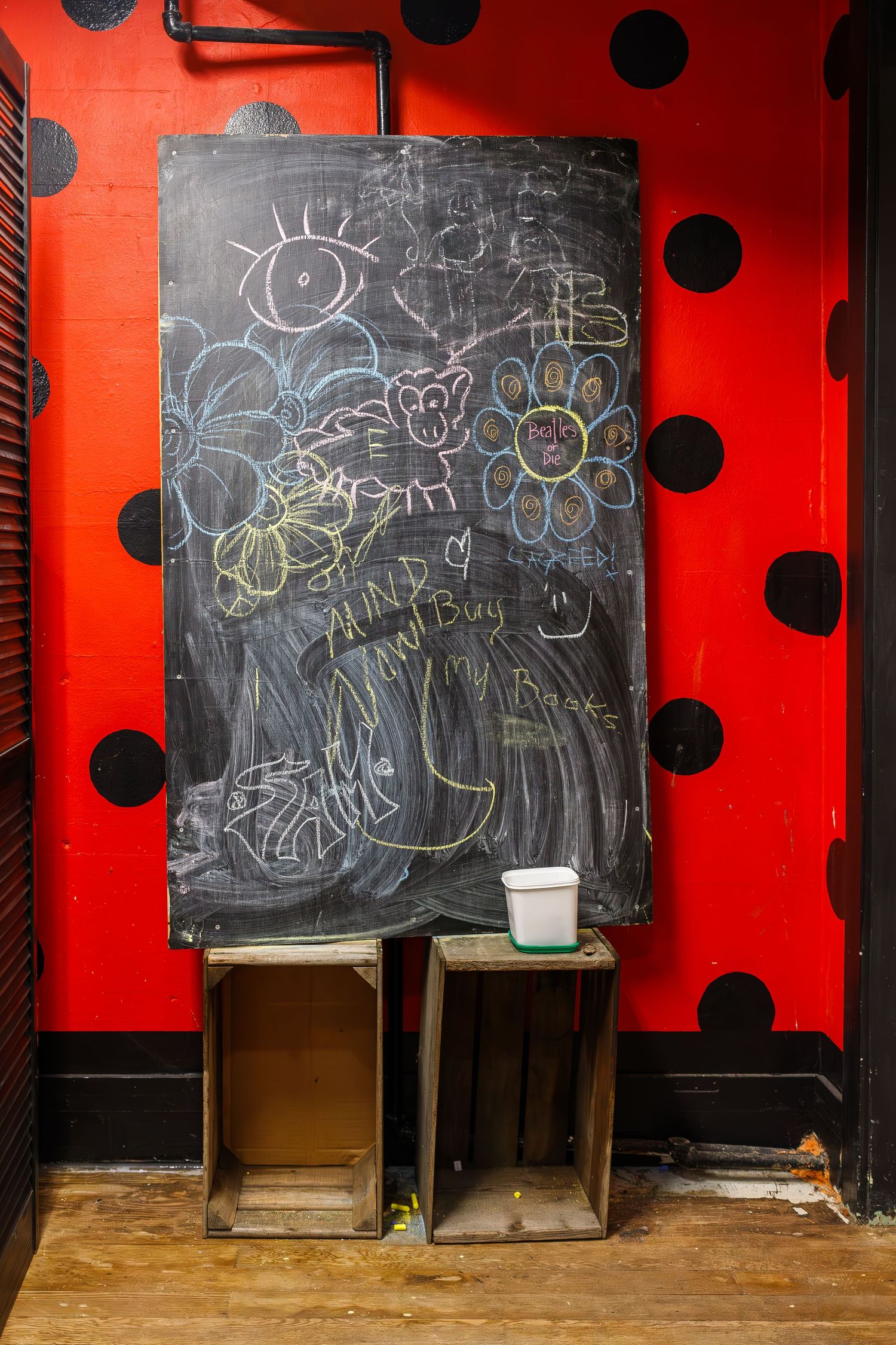
This place has a serious VIBE! I immediately felt at home with the chairs - larger versions of one I have had my whole life. They have so many coffee choices including various dairy free milks, snacks that are allergy friendly, lots of tables, games and activities for kids, I could go on. This place is a gem! Please go and visit!
Links
Click below to go to each platform:
Artisans Books & Coffee Website
Artisans Books & Coffee Facebook
Artisans Books & Coffee Instagram
Head on over to Christina Miller Virtual Services - Instagram for more on business branding!
